Title: Creating a Responsive Dashboard with Bootstrap 5 A Comprehensive Guide
Bootstrap 5 provides a robust framework for building responsive and visually appealing dashboards. A well-designed dashboard can offer a centralized view of important metrics, data, and functionality. In this guide, we will walk through the steps to create a responsive dashboard using Bootstrap 5, leveraging its grid system, components, and utilities to achieve an effective design.
Why Use Bootstrap 5 for Dashboards?
Bootstrap 5 is an excellent choice for dashboard development because it:
- Offers a responsive grid system: Adjusts content layout seamlessly across various screen sizes.
- Provides ready-to-use components: Includes navigation bars, cards, modals, and more that are essential for dashboards.
- Supports modern design: Incorporates utility classes for spacing, colors, and typography.
Steps to Create a Responsive Dashboard
- Set Up the Project
- Build the Layout with Bootstrap Grid System
- Add Components
- Customize the Dashboard with Custom CSS
- Test and Optimize for Responsiveness
1. Set Up the Project
First, set up your project with Bootstrap 5. You can include Bootstrap via CDN or by installing it through npm.
Using CDN:
<!DOCTYPE html>
<html lang="en">
<head>
    <meta charset="UTF-8">
    <meta name="viewport" content="width=device-width, initial-scale=1.0">
    <title>Responsive Dashboard</title>
    <link href="https://cdn.jsdelivr.net/npm/bootstrap@5.3.0/dist/css/bootstrap.min.css" rel="stylesheet">
</head>
<body>
    <!-- Dashboard content will go here -->
    <script src="https://cdn.jsdelivr.net/npm/bootstrap@5.3.0/dist/js/bootstrap.bundle.min.js"></script>
</body>
</html>
Using npm:
npm install bootstrap
In your main.js file or similar, import Bootstrap:
import 'bootstrap/dist/css/bootstrap.min.css';
import 'bootstrap/dist/js/bootstrap.bundle.min';
2. Build the Layout with Bootstrap Grid System
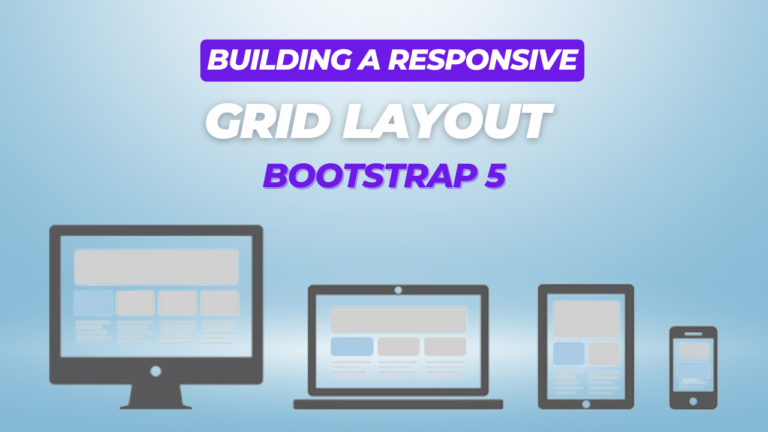
The Bootstrap grid system is key to creating a responsive layout. We’ll use containers, rows, and columns to structure our dashboard.
Example Layout:
<div class="container-fluid">
    <div class="row">
        <!-- Sidebar -->
        <nav id="sidebar" class="col-md-3 col-lg-2 d-md-block bg-light sidebar">
            <div class="position-sticky">
                <h4 class="text-center">Dashboard</h4>
                <ul class="nav flex-column">
                    <li class="nav-item">
                        <a class="nav-link active" href="#">Home</a>
                    </li>
                    <li class="nav-item">
                        <a class="nav-link" href="#">Profile</a>
                    </li>
                    <li class="nav-item">
                        <a class="nav-link" href="#">Messages</a>
                    </li>
                    <li class="nav-item">
                        <a class="nav-link" href="#">Settings</a>
                    </li>
                </ul>
            </div>
        </nav>

        <!-- Main Content -->
        <main class="col-md-9 ms-sm-auto col-lg-10 px-4">
            <div class="d-flex justify-content-between flex-wrap flex-md-nowrap align-items-center pt-3 pb-2 mb-3 border-bottom">
                <h1 class="h2">Dashboard</h1>
            </div>

            <!-- Dashboard Cards -->
            <div class="row">
                <div class="col-12 col-md-6 col-lg-4 mb-4">
                    <div class="card text-white bg-primary">
                        <div class="card-body">
                            <h5 class="card-title">Card Title</h5>
                            <p class="card-text">Some quick example text to build on the card title and make up the bulk of the card's content.</p>
                        </div>
                    </div>
                </div>
                <!-- Repeat more cards as needed -->
            </div>
        </main>
    </div>
</div>
3. Add Components
Bootstrap provides various components that can enhance your dashboard. Here are a few common ones:
- Cards: For displaying content in a flexible and extensible container.
- Tables: To present tabular data.
- Modals: For displaying interactive dialogs or forms.
- Charts: Integrate charting libraries like Chart.js for data visualization.
Example: Adding a Table
<div class="table-responsive">
    <table class="table table-striped">
        <thead>
            <tr>
                <th>#</th>
                <th>Item</th>
                <th>Details</th>
                <th>Status</th>
            </tr>
        </thead>
        <tbody>
            <tr>
                <td>1</td>
                <td>Item One</td>
                <td>Details about item one.</td>
                <td>Active</td>
            </tr>
            <!-- Repeat rows as needed -->
        </tbody>
    </table>
</div>
4. Customize the Dashboard with Custom CSS
While Bootstrap provides a solid foundation, you may need custom styles to achieve a unique look.
Example: Customizing Sidebar
#sidebar {
    background-color: #f8f9fa;
    height: 100vh;
}

#sidebar .nav-link {
    color: #333;
}

#sidebar .nav-link.active {
    color: #0d6efd;
    background-color: #e9ecef;
}
Link Custom CSS File:
<link href="path/to/custom.css" rel="stylesheet">
5. Test and Optimize for Responsiveness
Ensure your dashboard is responsive by testing it across different devices and screen sizes. Bootstrap’s grid system and responsive utilities will help your layout adapt to various screen widths.
Example: Responsive Utilities
<div class="d-none d-md-block">
    <!-- Content visible only on medium screens and up -->
</div>
<div class="d-block d-md-none">
    <!-- Content visible only on small screens -->
</div>
Conclusion
Creating a responsive dashboard with Bootstrap 5 involves leveraging its grid system, components, and utilities to build a layout that adapts to different screen sizes. By setting up your project, using Bootstrap’s built-in features, adding essential components, customizing styles, and testing responsiveness, you can build a functional and visually appealing dashboard.
